Take Thai Home
Case Study
Web Redesign
Client Project: A website redesign for a Thai restaurant focused on improving the digital menu experience and streamlining the online ordering process for both locals and international users.
Role: UX Designer (freelance)
Duration: 3 weeks (Feb 2024)
Tools: Figma
Methods: User Interviews, User Persona, User Journey, Wire framing, Prototyping
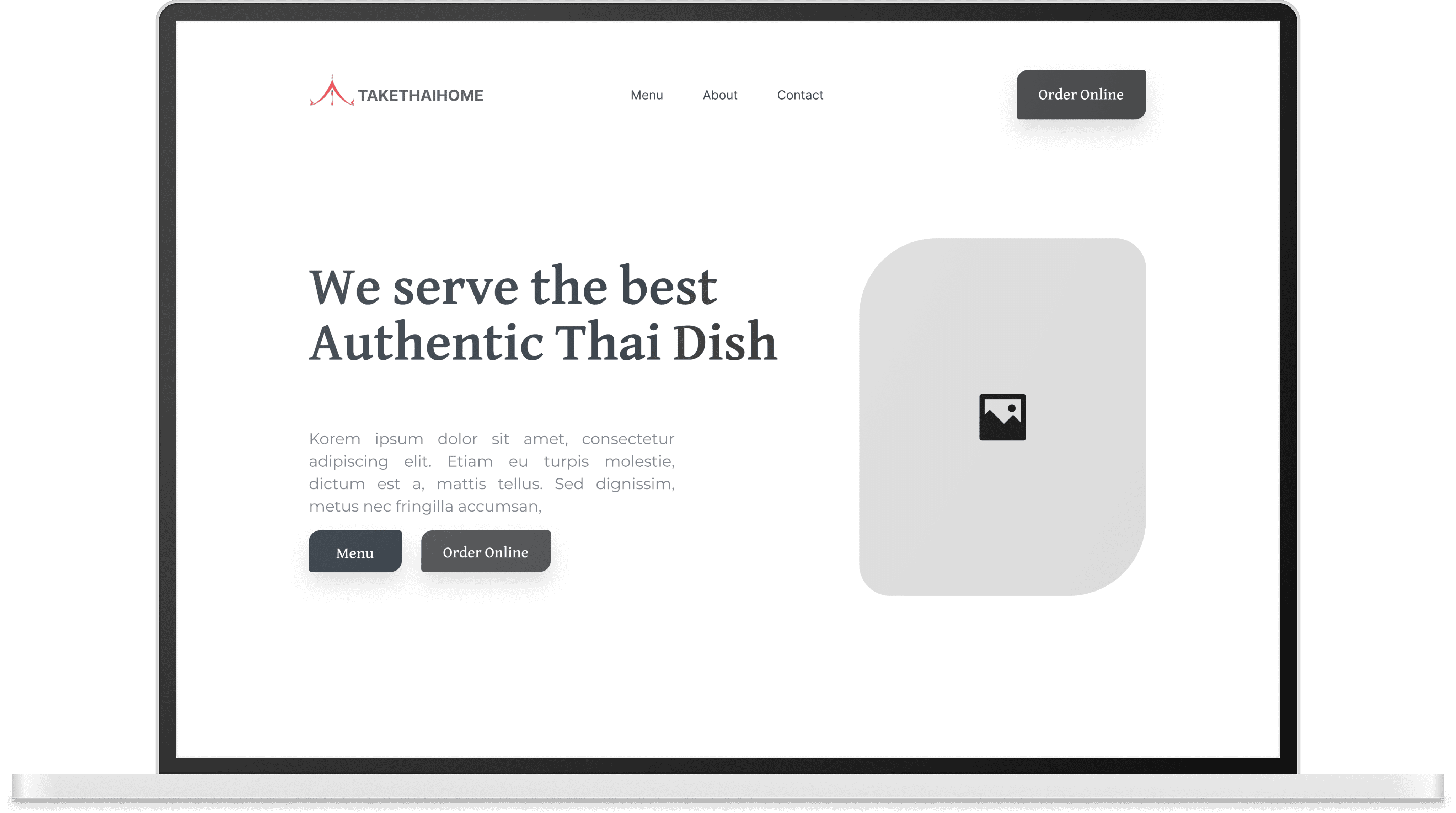
Before
After
OVERVIEW
Understanding the Users
The website is primarily used by locals in the Vancouver area, both loyal regulars and new customers discovering the restaurant online. Many customers are middle-aged or older, often with dietary restrictions, and rely heavily on mobile devices to browse menus and place orders. The owners also needed a solution that was easy for them to update themselves.
GOALS
Project Goals & Focus Areas
The primary objective of the redesign was to create a clean, easy to navigate one page website that clearly presented the restaurant’s key information while reflecting the brand’s warm, home style identity. Special attention was given to making the mobile experience more usable, by adapting it into separate pages to reduce scrolling and improve access. The goal was to balance aesthetics, simplicity, and functionality.
USER RESEARCH
Quick Research, Big Insights
To better understand the users and their needs, I conducted 10 interviews with local customers, 5 interviews with Thai staff members, and held stakeholder discussions with the restaurant owners.

“
”
I couldn't tell what was gluten-free
or not, and I didn’t want to risk it.
Key Takeaway: Users wanted clear visuals
and more detailed dietary information
“
”
It’s really hard to read on my phone,
especially when I’m in a hurry.
Key Takeaway: Mobile users found the experience frustrating and hard to navigate


“
”
We just want something clean,
easy to update, and nice to look at.
Key Takeaway: The owners expressed the need for a professional website that was simple for them to update on their own
Mobile-first experience: Emma expects the website to be responsive and easy to navigate on her phone.
Clear, trustworthy menus: Detailed menu descriptions and dietary tags to feel confident in her choices.
Minimal effort: Emma values convenience and expects a simple, streamlined experience without having to call or ask questions.
GOALS & NEEDS
Emma Thompson
38
Married
Marketing Manager
Vancouver, BC
Gluten-free
NAME
AGE
STATUS
OCCUPATION
LOCATION
Dietary Needs
USER PERSONA

Emma is a busy professional who juggles a fast-paced work schedule with a health-conscious lifestyle. She values efficiency, especially during work hours, and enjoys simple routines that support her well-being. Tech-savvy and independent, she relies on her mobile and digital services to manage her meals and daily tasks with ease.
LIFESTYLE
Unclear dietary information: Without clear gluten-free labels, Emma feels unsure about what’s safe to eat and often avoids ordering.
Poor mobile experience: Hard-to-read layouts and confusing navigation on website waste her time and create frustration.
PAIN POINTS
”
“
I don’t have time to guess what’s safe for me to eat. I just want to order quickly, from my phone, and feel confident it’s gluten-free.
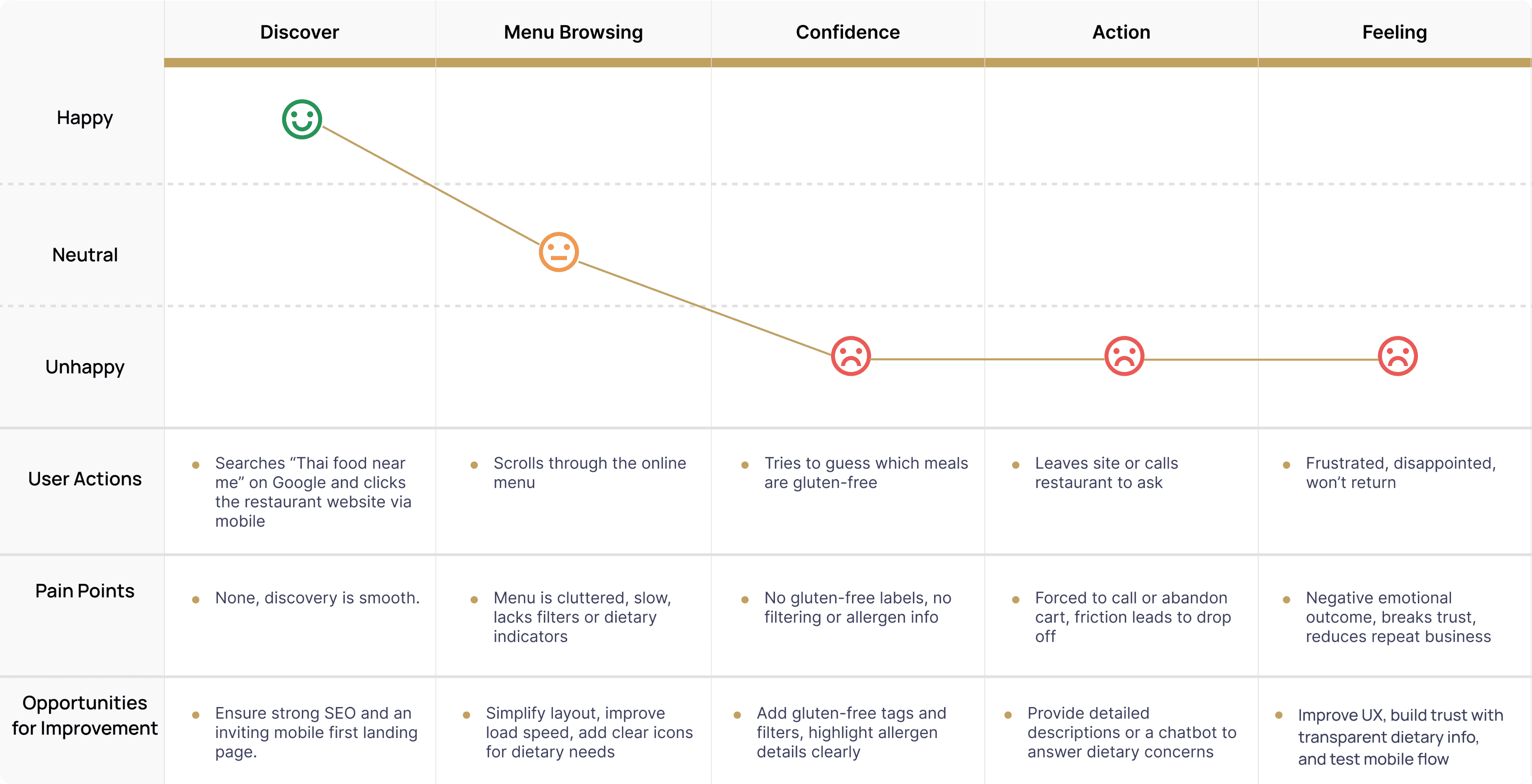
User Journey Map
To better understand how customers interact with the restaurant’s website, I created a user journey map highlighting their actions, thoughts, and pain points at each stage. This helped identify moments of friction especially for mobile users with dietary restrictions and guided design decisions to create a smoother, more confident ordering experience.
One Page, Tailored for Every Device
While the desktop site was designed as a single scrolling page for simplicity, the mobile version was adapted into multiple pages to enhance usability on smaller screens. This separation helped reduce scrolling fatigue, improve loading times, and make key actions (like viewing the menu or contacting the restaurant) more accessible on mobile.
This responsive adjustment ensured both desktop and mobile users had an experience tailored to their needs clean, easy to use, and optimized for context.

TESTING & ITERATION
Improving Based on Feedback
While formal usability testing sessions were not conducted due to project scope and timeline, feedback was gathered informally from the restaurant owners and several customers. This input guided key refinements such as improving button contrast, repositioning the order button for better visibility, and optimizing image file sizes to enhance loading speed. These adjustments helped improve overall usability and user satisfaction. Given more time, conducting structured usability tests, especially with older mobile users, would be a valuable next step to further enhance the experience.
Final Design
After rounds of feedback and refinement, the final design captures both function and feeling.
It’s simple, welcoming, and easy to use, just what the owner needed.
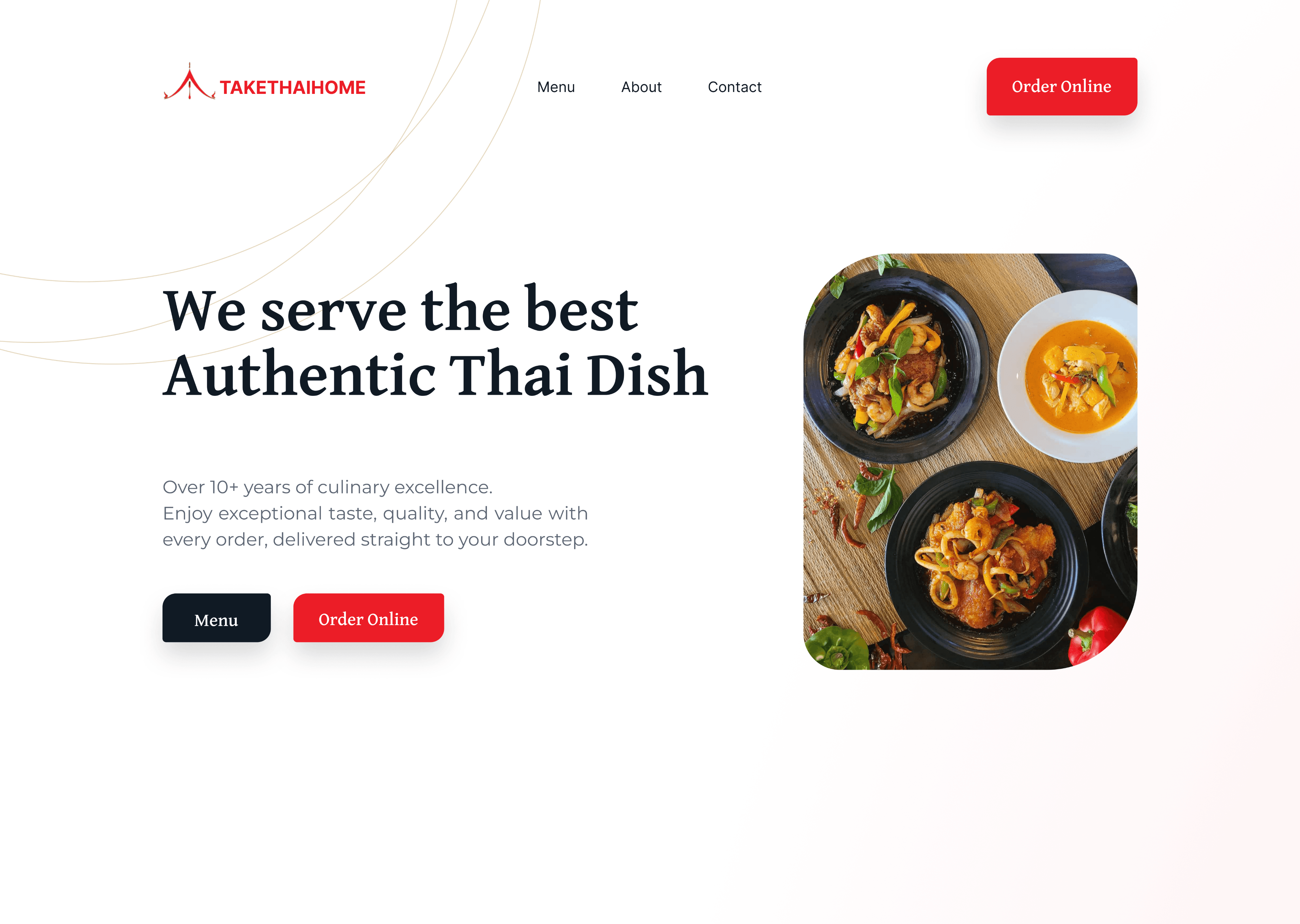
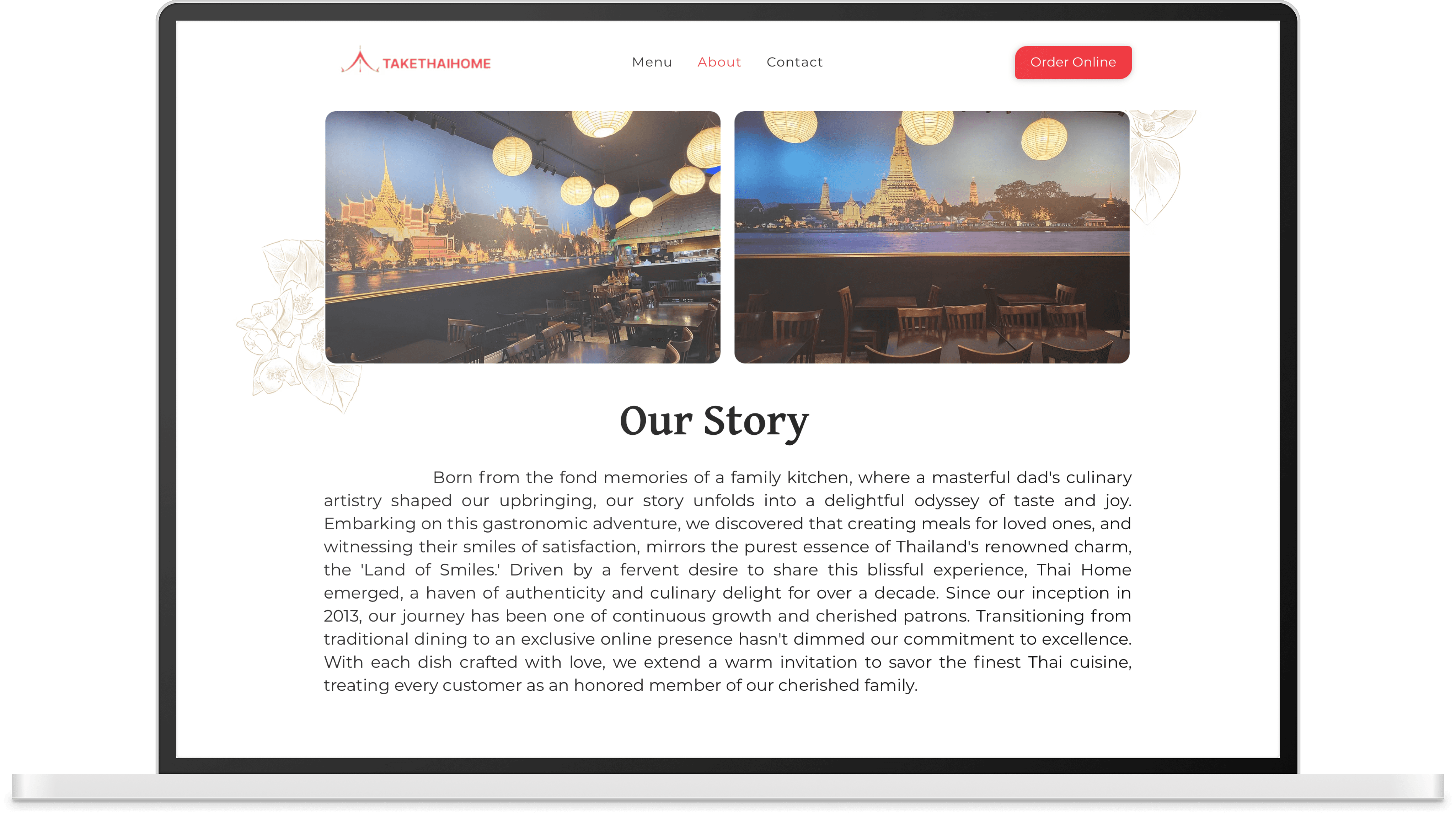
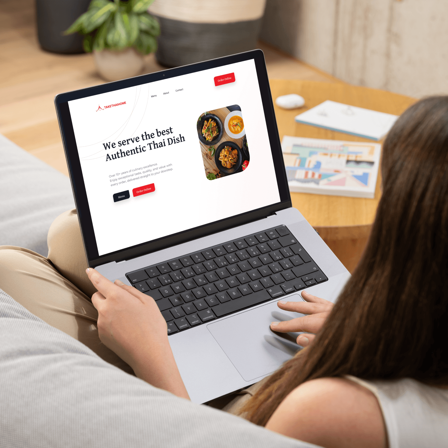
Home Page
The redesigned homepage features a clean white background and updated food imagery to create a fresh, appetizing first impression, improving visibility, usability, and encouraging conversions from the very first screen.
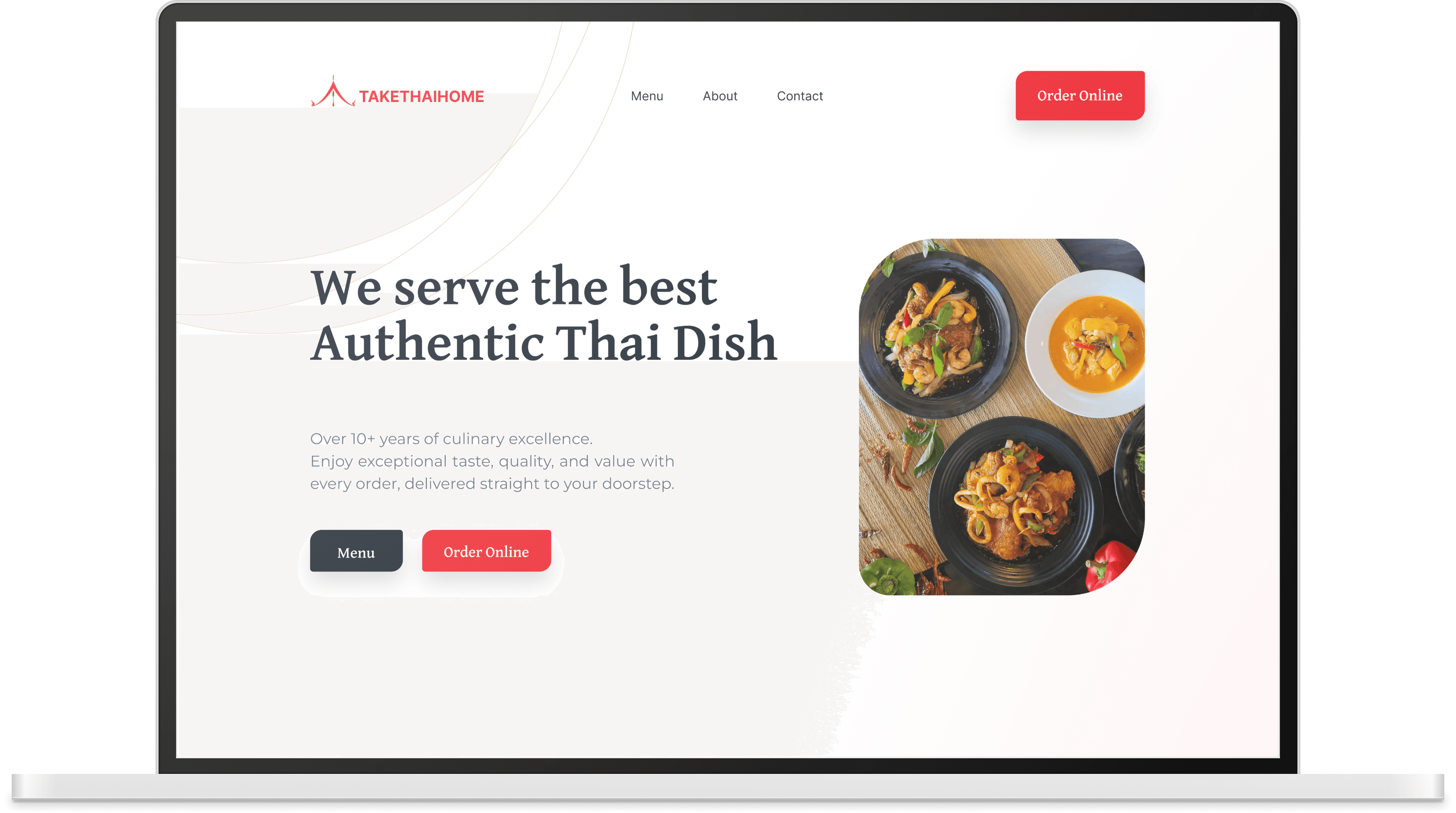
Call To Action
Directing users straight to the menu and ordering process
Highlight
The restaurant’s best dishes
Navigation Bar
Moved to the top for better visibility, allowing users to jump to each section with ease
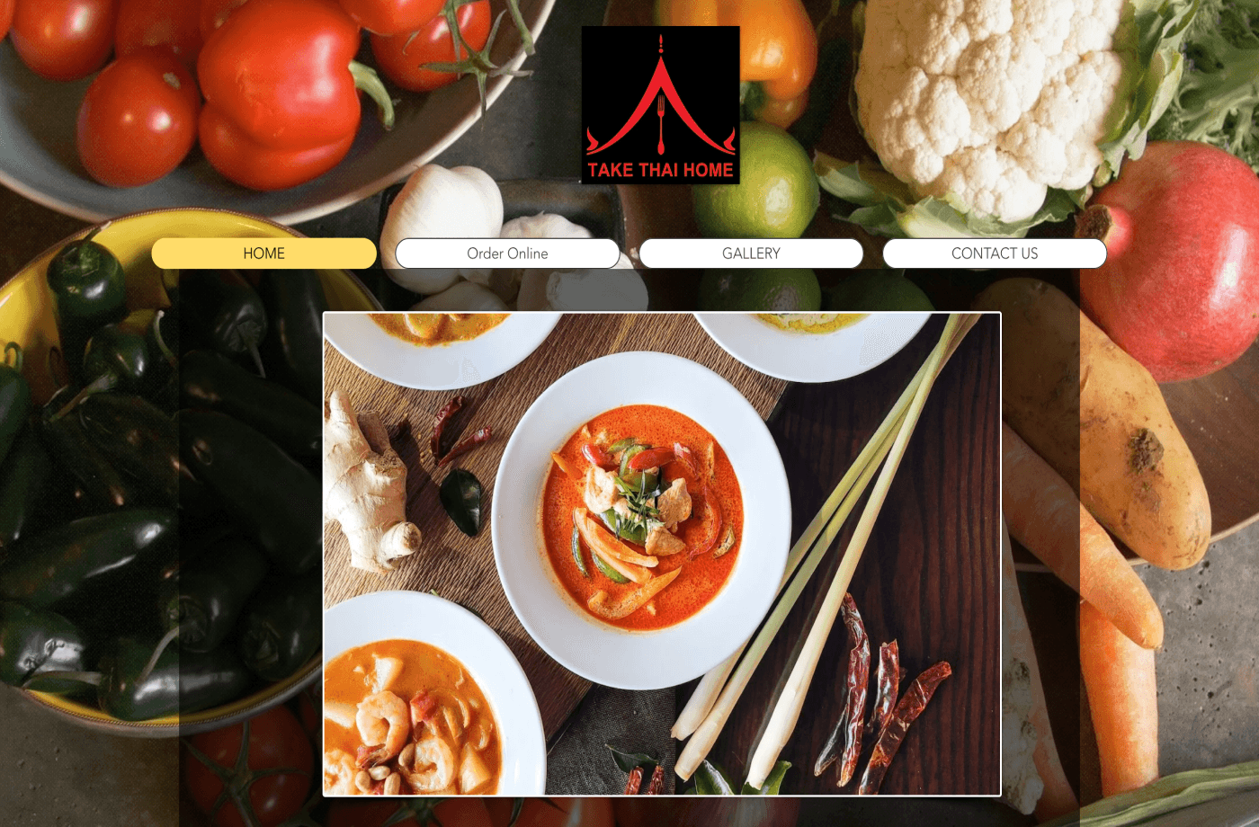
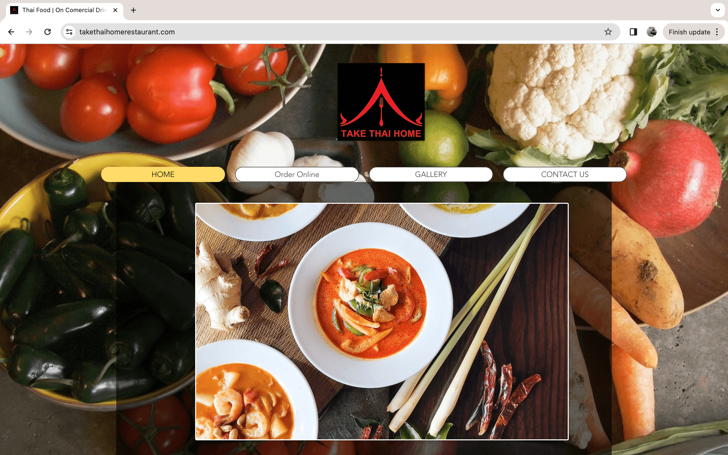
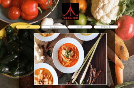
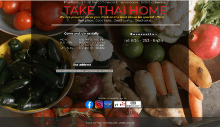
The Original Website
Popular Dishes
This section highlights customer favorites with clean visuals and simple dish names, giving users a quick preview of what the restaurant is known for.
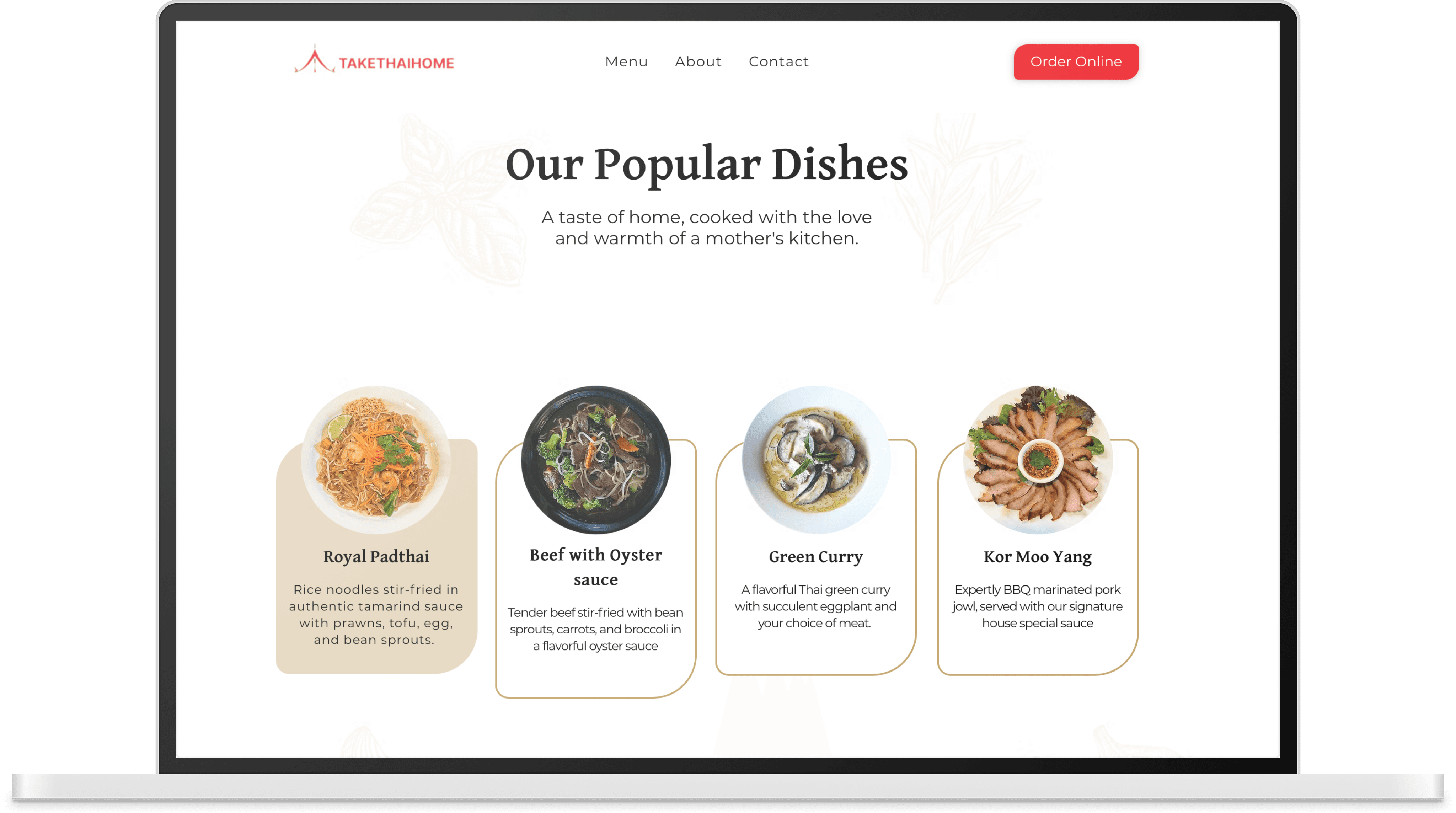

Icons
Menu
Divided into four easy to navigate categories, with a tap to reveal dish names and prices. Icons indicate which items are spicy
or vegetarian or gluten-free options are clearly labeled to support dietary needs and boost user confidence.

About
This section features a photo of the restaurant, as requested by the owners, and shares their story in a warm, welcoming tone. The original storytelling was transformed into a short, readable text that reflects the heart behind the business.
Promotion
Highlight current deals or special menu items. Designed to be easy for the owners to update, this space keeps regular customers informed and encourages repeat visits.


Pop Up
Before

After

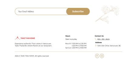
Contact Us
Redesigned for clarity and ease, this section now displays essential info like business hours, phone number,
and address in a clean layout. A new email field was added so customers can subscribe for updates
Feedback & Impact
Voices After the Redesign
After the redesign, informal feedback from the owners, staff, and regular customers was very positive. The owner felt the site looked more professional and better reflected their brand. Staff noticed fewer questions about the menu, saving time during busy hours. Customers appreciated the added clarity especially those with dietary restrictions, who felt more confident ordering online.
Looking Back: What I’d Explore Next
Given more time and resources, I would have loved to conduct formal usability testing with a range of customers including those unfamiliar with Thai cuisine to further refine the menu hierarchy and micro interactions. There were also opportunities to integrate more advanced features, such as:
Search and filter by dietary preferences
Multilingual support for diverse customers
Deeper analytics to track user behavior
While the project was completed under a tight timeline, working with a real client helped me strengthen my ability to balance business needs with user-centered design, communicate effectively with stakeholders, and deliver functional solutions within realistic constraints.
Let’s
Collaborate
drop an email at jiratchaya.jns@gmail.com
JEAN JURANUKUL
©
JEAN JURANUKUL
2025
Let’s
Collaborate
drop an email at jiratchaya.jns@gmail.com
JEAN JURANUKUL
©
JEAN JURANUKUL
2025
Maple Nest Case Study
Web Redesign
Role: Sole UX/UI Designer
Duration: 3 weeks (Feb 2024)
Client Project: A website redesign for a Thai restaurant focused on improving the digital menu experience and streamlining the online ordering process for both locals and international users.
Tools: Figma
Methods: User Interviews, User Persona, User Journey,
Wire framing, Prototyping
Before
After
OVERVIEW
Understanding the Users
The website is primarily used by locals in the Vancouver area, both loyal regulars and new customers discovering the restaurant online. Many customers are middle-aged or older, often with dietary restrictions, and rely heavily on mobile devices to browse menus and place orders. The owners also needed a solution that was easy for them to update themselves.
GOALS
Project Goals & Focus Areas
The primary objective of the redesign was to create a clean, easy to navigate one page website that clearly presented the restaurant’s key information while reflecting the brand’s warm, home style identity. Special attention was given to making the mobile experience more usable, by adapting it into separate pages to reduce scrolling and improve access. The goal was to balance aesthetics, simplicity, and functionality.
USER RESEARCH
Quick Research, Big Insights
Quick Research, Big Insights
To better understand the users and their needs, I conducted 10 interviews with local customers, 5 interviews with Thai staff members, and held stakeholder discussions with the restaurant owners.
“
”
I couldn't tell what was gluten-free
or not, and I didn’t want to risk it.
Key Takeaway: Users wanted clear visuals
and more detailed dietary information
“
”
It’s really hard to read on my phone,
especially when I’m in a hurry.
Key Takeaway: Mobile users found the experience frustrating and hard to navigate
“
”
We just want something clean,
easy to update, and nice to look at.
Key Takeaway: The owners expressed the need for a professional website that was simple for them to update on their own
Mobile-first experience: Emma expects the website to be responsive and easy to navigate on her phone.
Clear, trustworthy menus: Detailed menu descriptions and dietary tags to feel confident in her choices.
Minimal effort: Emma values convenience and expects a simple, streamlined experience without having to call or ask questions.
GOALS & NEEDS
Emma Thompson
38
Married
Marketing Manager
Vancouver, BC
Gluten-free
NAME
AGE
STATUS
OCCUPATION
LOCATION
Dietary Needs
USER PERSONA
Emma is a busy professional who juggles a fast-paced work schedule with a health-conscious lifestyle. She values efficiency, especially during work hours, and enjoys simple routines that support her well-being. Tech-savvy and independent, she relies on her mobile and digital services to manage her meals and daily tasks with ease.
LIFESTYLE
Unclear dietary information: Without clear gluten-free labels, Emma feels unsure about what’s safe to eat and often avoids ordering.
Poor mobile experience: Hard-to-read layouts and confusing navigation on website waste her time and create frustration.
PAIN POINTS
I don’t have time to guess what’s safe for me to eat. I just want to order quickly, from my phone, and feel confident it’s gluten-free.
”
“
User Journey Map
To better understand how customers interact with the restaurant’s website, I created a user journey map highlighting their actions, thoughts, and pain points at each stage. This helped identify moments of friction especially for mobile users with dietary restrictions and guided design decisions to create a smoother, more confident ordering experience.
One Page, Tailored for Every Device
While the desktop site was designed as a single scrolling page for simplicity, the mobile version was adapted into multiple pages to enhance usability on smaller screens. This separation helped reduce scrolling fatigue, improve loading times, and make key actions (like viewing the menu or contacting the restaurant) more accessible on mobile.
This responsive adjustment ensured both desktop and mobile users had an experience tailored to their needs clean, easy to use, and optimized for context.
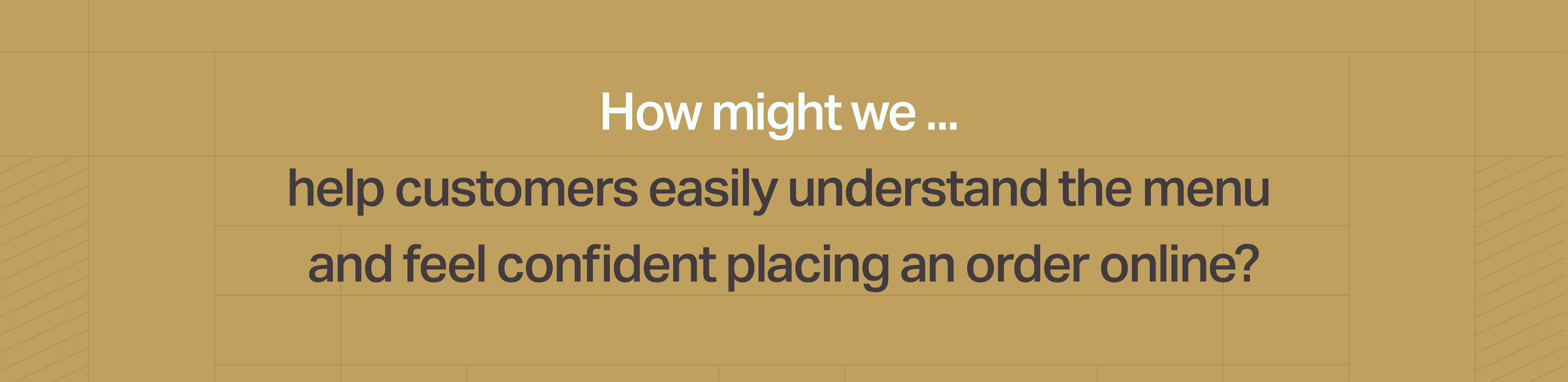
How might we ...
help customers easily understand the menu
and feel confident placing an order online?
Testing & Iteration
Improving Based on Feedback
Improving Based on Feedback
While formal usability testing sessions were not conducted due to project scope and timeline, feedback was gathered informally from the restaurant owners and several customers. This input guided key refinements such as improving button contrast, repositioning the order button for better visibility, and optimizing image file sizes to enhance loading speed. These adjustments helped improve overall usability and user satisfaction. Given more time, conducting structured usability tests, especially with older mobile users, would be a valuable next step to further enhance the experience.
While formal usability testing sessions were not conducted due to project scope and timeline, feedback was gathered informally from the restaurant owners and several customers. This input guided key refinements such as improving button contrast, repositioning the order button for better visibility, and optimizing image file sizes to enhance loading speed. These adjustments helped improve overall usability and user satisfaction. Given more time, conducting structured usability tests, especially with older mobile users, would be a valuable next step to further enhance the experience.
Final Design
After rounds of feedback and refinement, the final design captures both function and feeling. It’s simple, welcoming, and easy to use, just what the owner needed.
Home Page
The redesigned homepage uses a clean white background and appetizing food imagery to create a fresh first impression and guide users to action quickly.
Call To Action
Directing users straight to the menu and ordering process
Highlight
Best dishes
Navigation Bar
Moved to the top for better visibility, allowing users to jump to
each section with ease
The Original Website
Popular Dishes
This section highlights customer favorites with clean visuals and simple dish names, giving users a quick preview of what the restaurant is known for.
Icons
Menu
Divided into four easy to navigate categories, with a tap to reveal dish names and prices. Icons indicate which items are spicy or vegetarian or gluten-free options are clearly labeled to support dietary needs and boost user confidence.
About
This section features a photo of the restaurant, as requested by the owners, and shares their story in a warm, welcoming tone. The original storytelling was transformed into a short, readable text that reflects the heart behind the business.
Promotion
Highlight current deals or special menu items. Designed to be easy for the owners to update, this space keeps regular customers informed and encourages repeat visits.

Pop Up
Contact Us
Redesigned for clarity and ease, this section now displays essential info like business hours, phone number, and address in a clean layout. A new email field was added so customers can subscribe for updates
Before
After
Takeaway & Next Steps
Designing Maple Nest revealed how essential user feedback is to creating an intuitive and meaningful experience. While I started with a rough concept, research and testing uncovered key usability issues and led to a design that evolved far beyond the original idea.
Due to time constraints, not all user suggestions could be implemented but they highlight valuable directions for future development. Expanding research to include landlords would also provide a more balanced perspective.
Looking ahead, I plan to enhance the app with features like an in-app calendar or review system to support users through every step of their housing journey. Additional testing will help refine the experience and ensure Maple Nest continues to meet user needs.